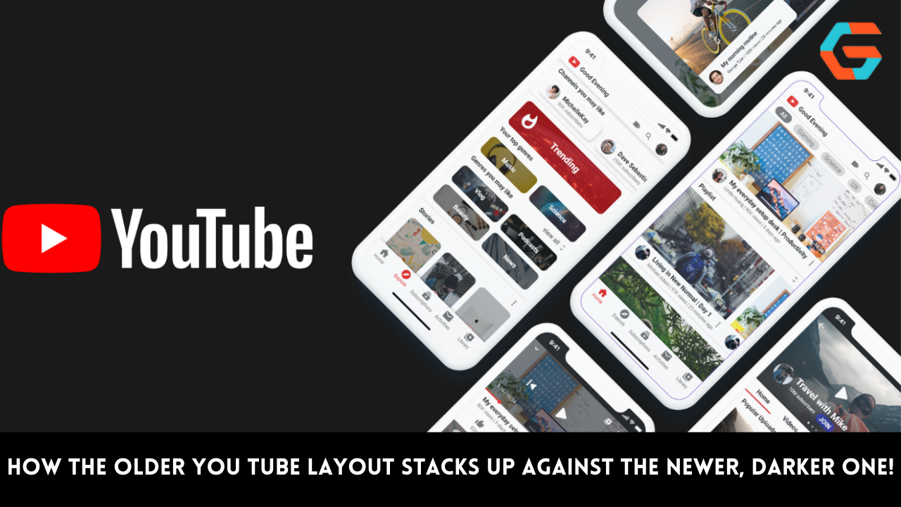

YouTube’s new, darker design, which was announced on Monday, is now live. The way YouTube is organized doesn’t alter fundamentally, but when all of these changes are combined, they result in a more significant update than what was foreshadowed earlier in the week. After installing the server-side update, you’ll see a “New look, still YouTube” prompt on Android and iOS.
Downloading the most recent version of the mobile apps is advised. On the following page, “Pinch to zoom in fullscreen” is strongly underlined, and an 8x magnification is possible. The background is darker (#0F0F0F), albeit it’s still not fully black if YouTube’s dark theme is enabled. People have long desired this in mobile apps, and it matches YouTube Music.
You’ll see that video thumbnails in the Library tab now have rounded borders, and this modification was also made to the website makeover. YouTube now prominently displays a cover thumbnail for playlists, however, you first see fewer videos. Using pill-shaped buttons leverage extra emphasis on the download and edit buttons, which are now in circles.
The video page has undergone the next round of updates. Ambient mode is usually turned on, which causes the video you’re watching to bleed into the status bar and the video description below, respectively, at the top and bottom. It will take some getting used to, and vivid colors perform better than muted ones.
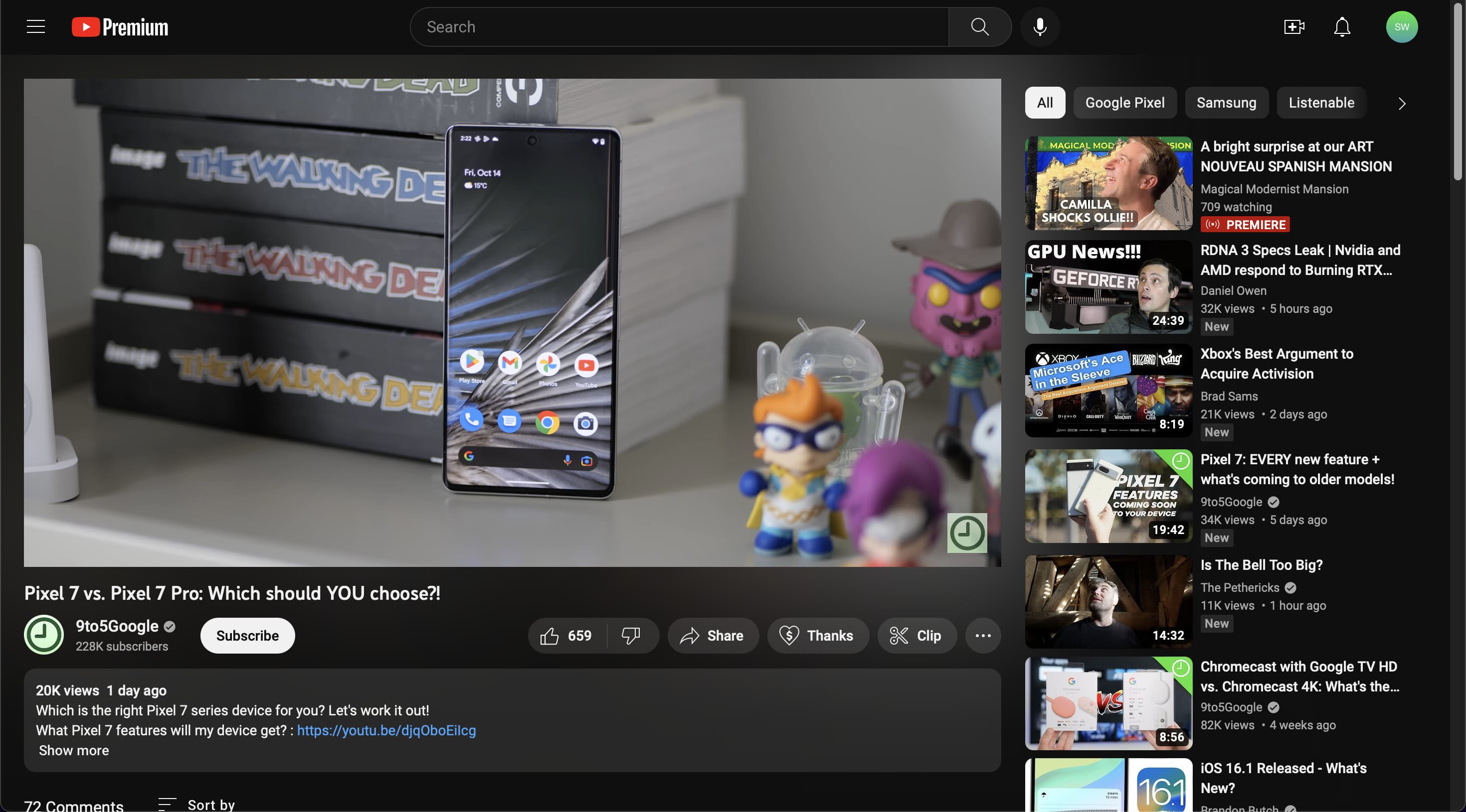
Fortunately, you can turn it off by selecting the fourth option from the menu when you hit the settings gear in the top-right corner. Tap anywhere to access the descriptions below the video, but YouTube now uses “more” in place of a chevron. Additionally, pills with the title of the video have taken the role of links to provide a more attractive preview.
Following that is the channel name, and the Google service has changed the subscribe button such that it is no longer red. (Channel pages have had minor revisions to make them a bit clearer.) A carousel of important actions follows, including thumbs up/down, Share, Create, Download, Thank You, Clip, and Save. These buttons are all included in tablets.

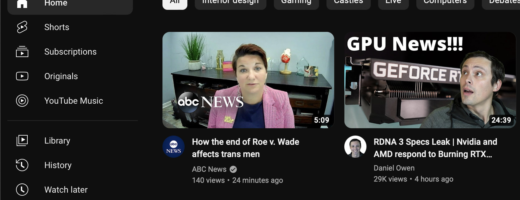
On a card, the top comment is now more noticeably highlighted. YouTube.com receives a number of Material Theme improvements on the desktop that are absent on mobile. For instance, instead of pills, the carousel directly below the search bar now features rectangles with rounded corners, and the similarly rounded video thumbnails are much more noticeable in this area.
Beyond the darker look, similar changes are made to the layout below the video on the video page, where Ambient mode is a little nicer. On a big screen, this bleeding appears to be quite elegant and extends to the side feed of videos. This updated YouTube is still being released and is not yet generally accessible.
Read More: Apple’s Security Update Guidelines Are Clarified: Only The Newest OSes Are Fully Patched!